
Scientific notation in R
July 11, 2020Sometimes you work with numbers that are pretty big. The combined GDP of the European Union. The population of India. The number of blog posts debating Python vs. R.
Imagine we’re dealing with 500 global companies that have an average market cap of 28 billion dollars with a standard deviation of 8 billion. Our summary statistics in R would look like this:
set.seed(123)
caps <- rnorm(500, 28000000000, 8000000000)
summary(caps)
## Min. 1st Qu. Median Mean 3rd Qu. Max.
## 6.713e+09 2.340e+10 2.817e+10 2.828e+10 3.348e+10 5.393e+10It is quite possible that I zoned out during this material while in grade school, but at first glance—and without knowing the dataset well—I find it difficult to interpret the values.
Plotting a histogram with ggplot2 doesn’t help as it also defaults to scientific notation along the x-axis, although at least it doesn’t pivot from e+09 to e+10 as seen with the summary.
library(ggplot2)
ggplot(data.frame(market_cap = caps), aes(x = market_cap)) +
  geom_histogram(color = "black", fill = "#1FA187") +
  labs(title = "Market cap for 500 global companies",
       x =  NULL) +
theme_minimal() 
Scientific notation
Before exploring some “hacks” to get rid of the strange notation, let’s take a look at how the translation actually works. Although not always useful, any number can be converted into scientific notation. R uses scientific e notation where e tells you to multiple the base number by 10 raised to the power shown.
Let’s start with the number 28. Scientific notation adds a decimal after the first number before applying the system. So 28 becomes 2.8 x 10^1 or 2.8e+01 in e notation.
If we were interested in a larger number, say 280 million, we’d still use 2.8 and then find the appropriate power to multiply ten by to reach 280,000,000. This would be 2.8 x 10^8 or 2.8e+08.
The average market cap of $28b for the 500 companies in our sample would require 2.8 x 10^10. So 2.8e+10 is equivalent to 28,000,000,000.
Here are the variants with a base 2.8 up through 10^10.
library(knitr)
sci <- data.frame(sci_note = 2.8 * 10^(1:10))
sci <- sci %>% mutate(translation = format(sci_note, scientific = FALSE, big.mark = ","))
kable(sci, col.names = c("Scientific Notation", "Full digit equivalent"))
| Scientific Notation | Full digit equivalent |
|---|---|
| 2.8e+01 | 28 |
| 2.8e+02 | 280 |
| 2.8e+03 | 2,800 |
| 2.8e+04 | 28,000 |
| 2.8e+05 | 280,000 |
| 2.8e+06 | 2,800,000 |
| 2.8e+07 | 28,000,000 |
| 2.8e+08 | 280,000,000 |
| 2.8e+09 | 2,800,000,000 |
| 2.8e+10 | 28,000,000,000 |
Side-stepping the interpretation problem
Targeted
If you want to avoid scientific notation for a given number or a series of numbers, you can use the format() function by passing scientific = FALSE as an argument.
big_number <- 28000000000
big_number
## [1] 2.8e+10format(big_number, scientific = FALSE)## [1] "28000000000"You can address the newly surfaced visual problem of too many zeros by adding comma separators with big.mark = ','
format(big_number, scientific = FALSE, big.mark = ',')## [1] "28,000,000,000"Universal
I generally apply the more aggressive solution by telling R to avoid all scientific notation by setting options(scipen=999) at the top of the script. This forces the full display.
options(scipen=999)
format(summary(caps), big.mark = ",") # using big.mark to add commas
## Min. 1st Qu. Median Mean 3rd Qu.
## " 6,712,617,612" "23,402,938,762" "28,165,737,180" "28,276,723,580" "33,481,690,122"
## Max.
## "53,928,319,480"After adding this bit of code, our histogram includes all the expected digits by default.
ggplot(data.frame(market_cap = caps), aes(x = market_cap)) +
  geom_histogram(color = "black", fill = "#1FA187") +
  labs(title = "Market cap for 500 global companies",
       x =  NULL) +
theme_minimal() 
Is this easier to read? Probably not, even if commas were added to breakup all those zeros. Thankfully we can use library(scales) to convert the axis labels to something more visually appealing. Here we call scale_x_continuous and pass the label_number function along with scale = 1e-9 in the labels argument. This tells the computer to scale back the data by 10^-9.
library(scales)

ggplot(data.frame(market_cap = caps), aes(x = market_cap)) +
  geom_histogram(color = "black", fill = "#1FA187") +
  labs(title = "Market cap for 500 global companies",
       x =  NULL) +
    theme_minimal() +
  scale_x_continuous(labels  =
label_number(scale = 1e-9, prefix = "$", suffix = "b", accuracy = 1)) 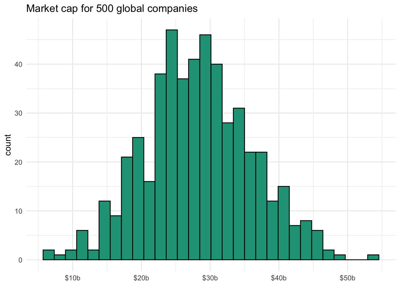
We can see this scaling work with our big_number variable of 28 billion, reducing it to the expected value of 28.
big_number * 10^-9## [1] 28Reverting back
You can toggle between scientific notation preferences in chunks of code by turning it off as described above with options(scipen=999) and reactivating it with options(scipen=0).
options(scipen=0)
big_number
## [1] 2.8e+10Related Courses
Related Learning Paths
5 Courses
7 Months
Tidyverse Skills for Data Science in R